Wordmark Logos: The Art of Simplicity in Branding
In the realm of branding and logo design, the wordmark logo stands out for its simplicity and impact. A wordmark logo, often referred to as a logotype, is a font-based logo that focuses on a business's name alone. This type of logo eschews graphic symbols, emblems, or icons, relying instead on the power of typography to convey a brand's identity.
The Elegance of Simplicity
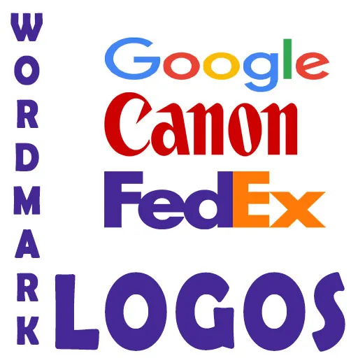
The beauty of a wordmark logo lies in its minimalism. Brands like Google, Coca-Cola, and Calvin Klein have leveraged the power of simple, type-only logos to create an iconic presence. The absence of symbols in wordmark logos places the emphasis on the brand name, making it immediately recognizable. This approach can be particularly effective for companies with a distinctive name that stands out on its own.
Typography as a Brand Ambassador
In wordmark logos, the choice of typeface becomes a critical decision. It's not merely about the aesthetic appeal; the font style conveys the personality and values of the brand. A well-chosen typeface can evoke emotions, create associations, and build a visual narrative around the brand. For instance, a heavy stencil typeface might evoke strength and durability, suitable for a brand like 'Army,' while a sleek, modern font could be perfect for a tech startup.
When to Opt for a Wordmark Logo
Wordmark logos are not a one-size-fits-all solution. They work best under certain conditions:
- If the business name is short and distinctive, a wordmark logo can help establish strong name recognition.
- For brands that plan to use their logo across various mediums, a wordmark's adaptability makes it a versatile choice.
- When a company's name is already well-known, a wordmark logo reinforces brand recognition without the need for additional symbols.
Designing a Wordmark Logo
Creating a wordmark logo may seem straightforward, but it requires a keen eye for detail. The spacing between letters (kerning), the weight of the typeface, and the color palette all play a significant role in the logo's effectiveness. A well-designed wordmark logo is balanced, legible, and aligned with the brand's messaging.
The Future of Wordmark Logos
As we move into an increasingly digital landscape, the clarity and scalability of wordmark logos make them a popular choice for businesses looking to stand out online. With screens of all sizes, from smartphones to billboards, a wordmark logo's legibility remains uncompromised, ensuring consistent brand representation.